Category: Blog

The Bologna Children’s Book Fair’s Illustrators Exhibition

Everybody in the world of children’s books knows what the Bologna Children’s Book Fair is, and how important it is in the publishing business. Every year, in the spring, publishers and agents come from all over the world to meet, talk, and buy and sell book rights.

But during the four days of activities, there are so many other interesting things going on on the fair’s ground and in the city: debates, presentations, exhibitions, award ceremonies… One can just take a brief look at last year’s program to get an idea. What I like the most when I manage to be there, is just walking around the booths and browse the thousands of new books on display. It’s an exhilarating, if intoxicating, experience.

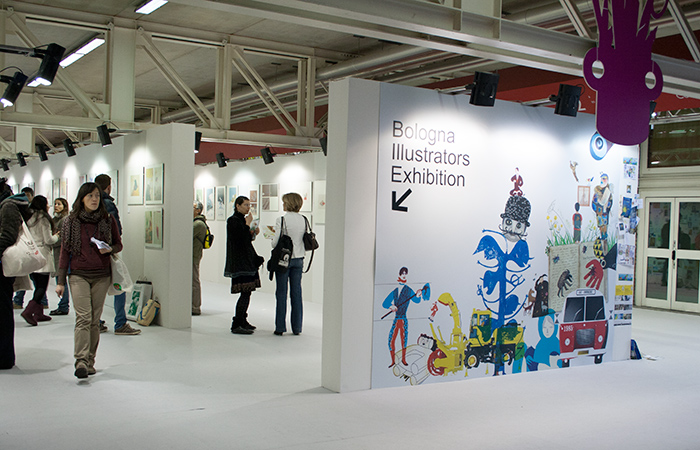
One event that is of particularly great interest for all children’s book artists, is the Illustrators Exhibition. I know that most U.S. illustrators have no idea of what I’m talking about, which is unfortunate. Every year, thousands of illustrators from all continents send their work hoping to be selected for the show. Only seventy or eighty artists get to be chosen each edition, and their works are hung in a gallery at the fair, and featured in a nicely produced catalogue. The show, once the fair is over, travels to other countries during the following months. As an aspiring illustrators, in my late teens, I used to send my submissions every year, until, too much hurt in my self-esteem by the continuous rejections, I ended that masochistic game. For some reason I am not aware of, this year I decided to try again, more than twenty five years after my last attempt. I got in. I am obviously very happy about it, but I can’t help wishing that my 19-year-old self could be with me now to celebrate.

Anyway, one of this year’s jurors, Anna Castagnoli (an excellent blogger and artist), has written an insightful diary of her experience judging the show. With her permission, I am translating her four posts and will publish them here, beginning just below. The pictures are also taken from her blog.

Just one more note for who’s planning to go to the Fair: in Bologna, I have experienced some of the most delicious food and friendliest hospitality of my life. It’s difficult to find a restaurant that will disappoint you, with the exception, in my experience, of the Drogheria della Rosa: I would suggest to avoid it.


Judging the 2014 Bologna Children’s Book Fair’s Illustrators Exhibition.

By Anna Castagnoli


(A preamble for all the illustrators who were not selected. A jury expresses a verdict that is only its own: it’s not an absolute judgement. A different jury might have made different choices. What follows is an account of our decisions: I share it because I find it to contain useful thoughts on illustration and its language.)


One juror’s diary
Day 1: the jurors get to know each other

January 21, 2014
We should have been five, as it’s usually the case at the Book Fair, but unfortunately Nadine Touma, from Libano, was denied the visa. In the evening of our first meeting, on the 12th of January, we had dinner with the Book Fair directors. The selection was to begin the day after, to last three long days.

The judges were:

Kitty Crowther, who in 2010 won the Astrid Lindgren Memorial Award, the “World’s Largest Children’s Literature Award.” She was still excited as she told us about the day she received the 500,000 Euros prize.

Isabel Minhos, publisher of Planeta Tangerina, the Portuguese house that last year won the Fair’s award as the best European publisher: quiet, with piercing eyes hidden behind dark-framed glasses.

Errol van der Werdt, director of the Dutch museum TextielMuseum, where art and technical research in the textile field are combined in order to create original designs of various nature. He is a man with a humanistic and artistic culture of immense refinement who was approaching the illustration world for the first time.

And myself, Anna Castagnoli: I suppose I was chosen for this prestigious invitation thanks to my work through all these years on the illustration blog Le Figure dei Libri (“the pictures in the books”).

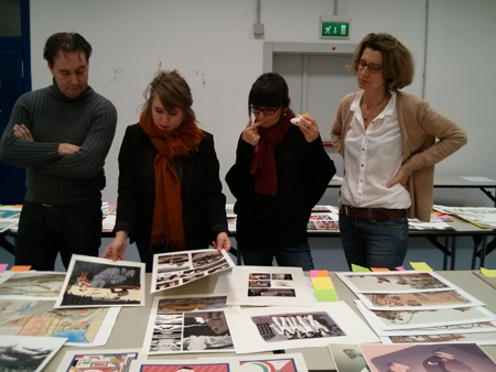
IMG_20140115_113512

Errol van der Werdt, Kitty Crowther, Isabel Minhos, Anna Castagnoli

It was an explosive combination, in a good way, but it became clear to us how thin the border between tension and constructive collaboration can be. Luckily, we were all in agreement on what the real values were; so flaws, personalities, and individual strains were left behind.

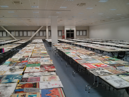
But let’s start from the beginning. The morning of the 13th of January, the doors of one of the Bologna Fair’s pavilions opened to offer us a breathtaking view: an enormous hangar full of endless tables buried by illustrations. To be precise: 15,940 original illustrations, for a total of 3188 illustrators from 191 countries. We were astounded: how could we judge all that in merely three days?
Fortunately, the Book Fair organizers’ experience, embodied by Deanna Belluti, assisted us. She is an elegant, kind, resolute French-Italian lady: without her firm and knowing hand we would never had made it.

IMG_20140113_165826

9 A.M.: observing in solitude
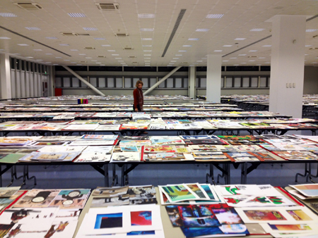
The first piece of advice was for each of us to take some solitary time – one and a half hour – to walk around the tables and get a personal idea of the works submitted. I started immediately for my adventure. The tables were divided by country, by school, and by the works being published or unpublished. I thought that the general level of the works was high and full of surprises. I felt the same feeling one experiences when one is in love: an absolute happiness to be in that ocean of images. It was as if I were swimming among fragments of light and color. I know very well how an illustration, for the artist who created it, is a fragment of herself. How many emotions were rising from those tables!
There were four long tables where drawings deemed not worthy had been grouped: a pre-selection done by the Book Fair’s graphic designers in order to help us with the screening. You shouldn’t think that those works were dismissed: they were in good display like the others, and we were invited to carefully examine them as well, to make sure no good work ended up there by mistake.
The pre-selection had been done with great care. Many images were not even illustrations: a number of tattoos, daubs, amateurish portraits. Right away, Kitty, Isabel, and I felt the eagerness to “save” the illustrators who ended up in that group. We found about ten, but it was more the enthusiasm of the rescue more than a good eye, as, if I remember correctly, none of those pieces made it to the final selection. The solitary journey lasted almost two hours. We then took a coffee break and they told us all about the second step.

photo11

11 A.M.: the team meets for the first selection
After coffee, we were invited to begin with the team work. Together, we were to walk around the tables and, for each of the groups of images that we didn’t deem deserving (each candidate submits five images), turn the first drawing of the stack face down: that meant for that illustrator to be out. We had agreed that a tiny bit of doubt was enough to keep a work in the game. Otherwise, face down. From this stage there was no going back, which made us especially cautious. Taking turns, we would spread the five images out, and if nobody said anything, we would put them back in their pile with the first image turned over. There was a minimal quality expectation that was clear to all, and we didn’t even have to discuss it.
Kitty and I were the most visibly eager to open the pile and touch the illustrations. Isabel would make punctual and precise comments. Errol was following us without saying a word: he had told us in advance that during this first day he’d prefer to just listen to us.
One of us would ask: Should I turn this over? And the other would answer: Yes. Sometimes one would say: Wait! I have a doubt, I think we should take another look. In which case, we we would move along without turning it over. After a few hours, Errol began to speak up as well, asking to keep in the running a few illustrators he had noticed. I was glad to see that his eyesight for illustration was much keener that I had feared.
At 6 in the evening, after many hours of work, we hadn’t finished all the tables yet. We took a look around us: overwhelming.
At the end of the evening, out of 3188 illustrators, about 260 were still in the game. Of these 260, only about eighty would have reached the final goal.
At night, in my hotel room, I felt bad for all those images that had been turned over. In many one could see some potential, but it was not enough. Maybe one image of the five was good, but not the remaining four. Sometimes, we wanted to paste a note on some of those drawings, with written: don’t give up!

As I was examining many drawings, I saw myself, many years back, disappointed and gloomy, going to pick up my rejected works at the Fair’s booth. I thought they were good, those drawings of mine. Why hadn’t they won? Now, after many years spent among books and illustrations, I knew why: they didn’t pass the minimum level of quality. They were amateurish, immature, pretentious, anatomically inaccurate, technically poorly accomplished, illiterate in the language of children’s book illustration, which needs to be digested and understood. It was just a beginning.
(I take advantage of this post to tell you this: do not give up! We have seen beautiful things that only lacked a bit of work and experience!)

In the next post, I will talk about the criteria we used for the second selection.

The Room of Wonders in Japanese

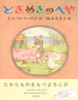
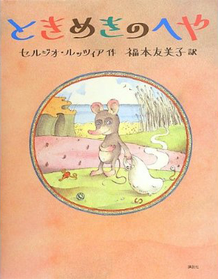
Many thanks to Yumiko Fukumoto for the translation and the big help in getting The Room of Wonders published in the Land of the Rising Sun!

Here is the cover, with and without the typical band over the jacket.

pio_j_con

pio_j_senza


Paul Zelinsky’s Picture Book List

I am very happy (if a bit bashful) to post Paul Zelinsky‘s list.

Note: Paul is usually not this blurry.

S.R.

Zelinsky

I’m glad this isn’t a list of my ten favorite picture books, but a list of ten of my favorite picture books, because I have tremendous trouble choosing favorites of anything, and I couldn’t bear making a list  that would omit the hundreds of  other choices that I could have, and probably should have, made.

It wouldn’t be too hard to come up with a list of ten great classics that belong in any list of ten, such as (in alphabetical order):

Ludwig Bemelmans’ Madeline
Margaret Wise Brown’s Goodnight, Moon
Eric Carle’s The Very Hungry Caterpillar
Wanda Gag’s Millions of Cats
Ezra Jack Keats’ The Snowy Day
Beatrix Potter’s Peter Rabbit
Maurice Sendak’s Where the Wild Things Are
Esphyr Slobodkina’s Caps for Sale
William Steig’s Sylvester and the Magic Pebble

(of course part of what defines a great classic is that it is older than the person calling it that. Some of these above are actually younger than I am, but not by a lot).

Instead,  I’m going to go for some other books that may be obscure but have meant a lot to me, or impressed me in some way, and might be interesting for people to take a look at. I’ll put them in antialphabetical order, by title.

The most obscure of the lot is:

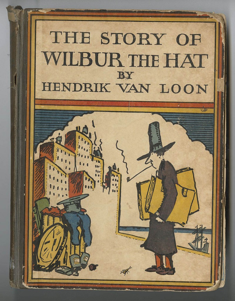
Wilbur the Hat
by Hendrik Van Loon
which I only know because I have my mother’s childhood copy of it.
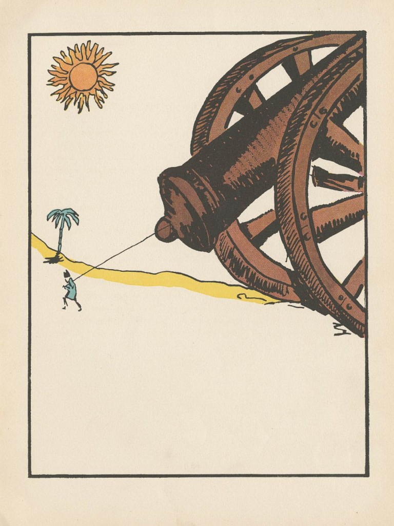
This 1925 tome is weird in more ways than I can count. It’s the story of Wilbur, a fedora from a men’s shop in Boston, who is so snobbish and awful to the other haberdashery on his owner’s dresser that Zeus in Olympus can’t take it anymore and blasts Wilbur to Kingdom-Come. There he floats down a river through the Part of the World that Does Not Exist, where a cricket named Cedrick climbs on board,  appointed by the Gods to expose Wilbur to a series of amazing wonders– natural, historical, philosophical, et al., in hopes that he might acquire a fitting respect for that which deserves respect, and the humility to go with it. The wonders are amazing, funny, and absurd; the illustrations are crazy; the tone of the book is lofty and deadpan. Best of all, the undeserving Wilbur remains cluelessly obnoxious, and unwittingly creates great havoc in Olympus. He ends up back in the States, gets sold for a dime to a young Sophomore and lives happily ever after. Most of this book sailed way over my head, but that’s no reason not to love it. On the contrary.

wilbur the hat coverwilbur the hat interior

Why Mole Shouted and More Mole Stories
by Lore Segal and Sergio Ruzzier
Segal’s Mole stories seem too simple to feel so rich, and Sergio, your idiosyncratic illustrations show them to be the extreme opposite of generic. Little Mole does childlike  but not necessarily laudable things that children do, such as yell loudly for no good reason,  eat the cookies he was asked not to, or play badly with Little Gopher, and where a generic children’s story would express opposition to these incorrect behaviors,  there they become reasons for Grandmother Mole to love Mole more. In the same way that our culture wants to make the standard for, say, femaleness, be a thin, perfectly Caucasian-featured  blonde woman, we are always being fed the expectation that little children should resemble the Gerber baby; we are supposed to say “oh, this is beautiful” when pictures show beautiful people according to the standard model. This is what the Mole illustrations don’t do. Noses and ears are not small; bellies protrude and eyelids sag. The moles don’t even look a whole lot like moles. But these are creatures overflowing with personality, where simply the turn of an ankle, or a slightly twisted smile makes you understand everything there is to know about them. In physics, larger particles such as protons have properties like charge and mass. But the smallest particles, quarks, have charm and strangeness. Ruzzier illustrates quarks.

Two Old Potatoes and Me
by John Coy and Carolyn Fisher
This is a very lovely text about a girl and her father planting potatoes and tending them until harvest. The illustrations explode it into a visual extravaganza that fits it so perfectly it is had to imagine the story having been illustrated in any other way. This is, I think, the first digitally illustrated picture book where it struck me that the digital nature of the illustrations was not a hindrance but an actual boon. It’s amazing to look at.

Tell Me a Mitzi
by Lore Segal and Harriet Pincus
Three separate stories told in a captivating, sort-of-childlike way, and illustrated in a similarly sort-of-childlike style. Pincus’ drawings are enchanting; beautifully composed and colored and a bit stilted in a comical way that fits the text perfectly. Harriet Pincus was a talented newcomer when she illustrated this 1970 book ; I believe that Maurice Sendak had something to do with her getting published. She illustrated perhaps six books, and then stopped; I don’t know anybody who knows what became of her. I see that in 1973 all of her original work was donated to the DeGrummond Collection in Louisiana.

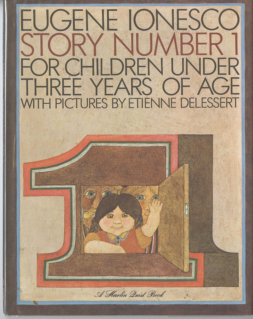
Story Number 1
by Eugene Ionesco and Etienne Delessert
I had enjoyed a number of Ionesco’s absurdist plays in high school English (and French) and was delighted to see in my college bookstore three big picture books for children: Stories number 1, 2 and 3.  In Story Number 1, a little girl named Josette torments her parents with her tale of the previous days’ goings-on involving the maid Jacqeline,. In Josette’s telling, everyone and everything was called Jacqueline. Delessert’s surreal pictures are bold and elegant. I think he used wax in some way with his paint. I met Delessert for the first time about ten years ago; he told me that it was he who convinced Ionesco to write these stories, and he organized their illustration, doing the first one himself. He has subsequently reillustrated all of them.  I didn’t care for Story #3 but loved the other two. #2 was beautifully illustrated in watercolor by Philippe Corentin; it is a similarly endearing and nonsensical story.

Story Number 1

The Philharmonic Gets Dressed
by Karla Kuskin and Marc Simont
This low-key, small-sized, three-color book sails above all the limitations of its format. It’s about putting clothes on, with poetic attention to detail, but builds to a musical crescendo that is as exhilarating as its premise is unlikely.  A triumph of pictures and words working in tandem, and leaving space for each other. I think it’s too bad it didn’t win the Caldecott Medal.

Locomotive
by Brian Floca
I only recently saw this big book and was so impressed that I’m putting it in this list. It’s got all you could want of technical train information, and it’s a travelogue and a poem as well. And there’s a freedom to the execution of it that allows all the grandeur in, but keeps it feeling close and familiar.

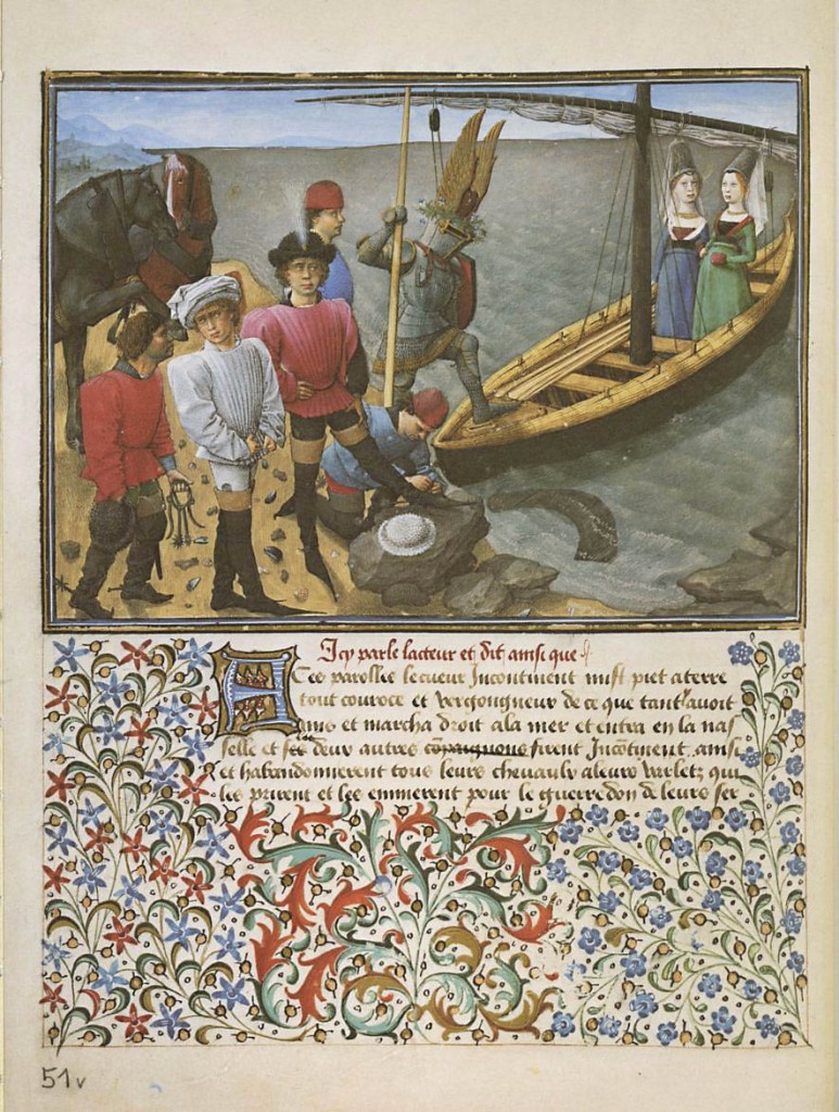
King René’s Book of Love
by René, duke of Anjou and King of Sicily; illustrator unknown
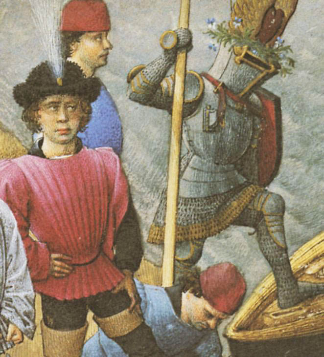
Not a children’s book, this is an allegorical romance, a French illuminated manuscript from the mid-1400’s, written and some say illustrated by one René, Duc d’Anjou. I would love someday to see the real thing, which resides in the Austrian National Library in Vienna, but a book published by Braziller in 1975 contains beautifully reproduced facsimiles of the illustrated pages. I fell in love with the pictures. With an amazing sense of light and color and rounded form, these pictures exhibit an even more amazing presentation of personality and character, with a pointillist precision that makes you want to bury your nose in the images, or at least bring a magnifying glass to them. It’s over 500 years old but feels like a wonderful children’s book. And I hate the word “fresh,” but I’d be inclined to use it in this case.

love1love2


Harold and the Purple Crayon
by Crockett Johnson
This book should really have gone in my theoretical list of ten books above. Since I left it out, I’m putting it in here. I don’t always believe that less is more, or I wouldn’t have made elaborate books of my own like Rapunzel, but sometimes the best results come from a minimalist presentation and that’s the case here. Weston Woods made an animated version of this book that is well worth looking at. And if you can find something on the making of that animation, that would be worth looking at, too.

The Color Kittens
by Margaret Wise Brown and Alice and Martin Provensen
Another one of my childhood favorites. I can’t really express the excitement I would feel with each new color that the color kittens mixed up. Except for brown; as a child I was no fan of brown. Margaret Wise ones excepted.
Paul Zelinsky

Festivaletteratura 2013

Festivaletteratura is a book festival of great importance in the Italian literary world. Every year, at the beginning of September, thousands of people invade, mostly pacifically, the beautiful city of Mantua to hear authors speak about their books, participate in public debates, take workshops, etc.

mantova_view

http://www.visitsitaly.com/images/lombardia-im/mantova-im/mantova_view.jpg

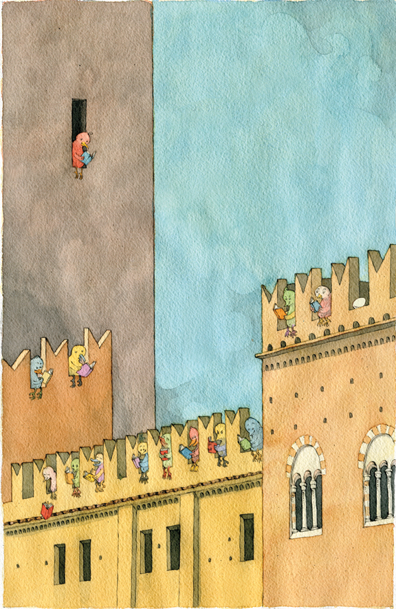
Every year, a different illustrator is asked to provide an original illustration to decorate the posters, the programs, the t-shirts, and I don’t know what else. Past editions showcased the artwork of, among others, Alessandro Sanna and Federico Maggioni.

This year, the organizing committee, through designer Pietro Corraini, picked me. Very nice of them.

Here’s my drawing:

mantova_finale72

And here’s the sketch:

mantovasketch1


Bob Shea’s Picture Book List

Bob Shea reveals his secret obsessions!

Bob_Shea_BIO

This is tough because Sergio straight up told me I couldn’t stick my own books in here or he’d swap them out with his.

That kind of screws me because I am only familiar with my catalog.

So it’s on to plan B – a trip to the local library to see what I can dig up.
Some quick googling should tell me if my town has a library or not. Wish me luck.
Good news. It’s like a block away. I found some promising titles. Here they are.

1. The Stinky Cheese Man and other Fairly Stupid Tales.
Jon Scieszka and Lane Smith. Designed by Molly Leach (very important)
This is the one that started it all for me. Picking it up in the bookstore I thought,
“There’s no way the inside can pay off the cover.”
Boy did it ever. It’s hilarious, great illustrations and the typography is freaking amazing.
A perfect, thoughtful package. I was doing graphic design at the time and I couldn’t get over how well the type supported and enhanced the story.

It was eye opening to see something so funny taken so seriously.

2. I Want my Hat Back
Jon Klassen
I’m just glad to bring this book from the shadows into the light of day, even for a
moment.
This was the same experience as Stinky Cheese. I saw this in the bookstore and immediately had a design crush.

The simple, confident layout, the bear staring off into the middle distance too preoccupied by a missing hat to pose for the cover of his own book.
“Don’t judge it by that.” I told myself.
Then I foolishly opened it. That thing is so perfect it could melt the face off a Nazi.
The character design, the palette, the typography, the understated layouts. Gorgeous.
Oh, and it’s funny. Not “BLAH! LOOK AT ME!” funny. Smart funny.
Halfway through I was pretty envious and tried to talk myself down.
“It’ll be okay,” I thought, “there’s no way he can pay this off. They’ll hug it out at the end, or come up with an elaborate schedule to share the hat, you’ll see.”
At the satisfying conclusion I whispered a tiny, defeated “f-me” in the kids section of my local bookstore.
So you think I could at least harbor some life-affirming petty resentment against the guy, right? Well, turns out Jon is pretty nice in real life. He’s stolen that joy from me too.

3. Arnie the Doughnut/Scrambled States of America
Laurie Keller
I love Laurie Keller.
I am grouping two titles together because I love them both for the same reason. They are super funny and charming. My son is nine and he still pulls them off the shelf at night. One reason he likes them so much is that his Dad cracks up every time. Plus they are jam packed with jokes. I am still finding little gems in there.
Both of these are Laurie Keller’s lovely, funny personality in concentrated book form.

4. When Randolph Turned Rotten
Charise Mericle Harper
Charise is a genius.
The reason I love this book is really simple. Randolph is a jerk. Not only does he fall prey to petty jealously, he acts on his feelings. Randolph’s friend Ivy gets invited to a sleepover and he doesn’t. So he’s like, “Okay cool, maybe next time.” Right?
WRONG! He fills her bag with logs! Oh, he’s a beaver I forgot to tell you.
Charise is great about not handing the reader the story they expect. It’s like a bait and switch scam where you get something better than you came for.

5. Frog and Toad are Friends
Arnold Lobel
Do I really have to explain this one?
I remember these as a kid but forgot how clever and dry they are. Of course at the time I was probably like, “Talking frog. Cool. Can we go see Star Wars again?”
I love these books.

6. Sparkle and Spin
Ann and Paul Rand
Yum.
Don’t know why? Google it. I’ll wait.
Now view by images.
See?

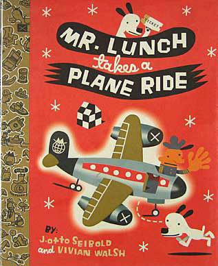
7. Monkey Business/Mr. Lunch series
Vivian Walsh J. Otto Seibold

seibold_mr_lunch_plane_cvr
Okay, this is many books, I am not following the rules. Again, I love these books for the same reasons. Vivian Walsh’s playful, absurd, matter-of-fact text and
J. Otto’s modern fever dream illustrations.
Monkey Business is almost twenty years old and it feels like it could come out in like, I dunno, five years.

8. Supposing…
Alastair Reid and Bob Gill
This book is so fantastic. Every page starts with the word “Supposing” then launches into a bizarre scenario.
“Supposing a funny old fortune teller told me I was going on a journey and just to bamboozle her I stayed home for the rest of my life…”
Stuff like that.
Oh wait, here’s another one.
“Supposing I telephoned people I didn’t know in the middle of the night and practiced my horrible sounds over the phone…”
Ha!

9. The Animal Fair
Alice and Martin Provensen
Honestly, I don’t know if I have actually ever read it. I sure do look at it all the time though.

10. The very Persistent Gappers of Frip
George Saunders and Lane Smith

gapper_lanesmith
Did you read that? George Saunders and Lane Smith.
Again a perfect package. A modern fable and some of my favorite Lane Smith illustrations ever. Luckily I picked it up when it came out, so I have the beautiful translucent cover that Molly Leach designed.
It’s beautiful.
I think I’ll read it right now…


This is also against the rules, but I think these illustrators are doing fantastic work.
Two years. That’s how long Zach Ohora will keep answering my emails before he figures out “the riffraff” is holding him back. Greg Pizzoli? Six months.
Do you guys know Peter Brown? Didn’t think so. Google him, you’ll be pleasantly surprised.
If Lucy Cousins makes it, I want it. Also, Lauren Child. Oh and Delphine Durand.
Ice cream. I like ice cream. I like when they pour espresso over it.
Sorry. Now I’m just listing things I like.

Melissa Guion’s Picture Book List

The picture book lists are back! Melissa Guion starts the new series, and she’ll be followed very soon by Bob Shea.

Melissa is the author-illustrator of BABY PENGUINS EVERYWHERE! and the upcoming BABY PENGUINS LOVE THEIR MAMA! She lives in Brooklyn with her daughter and a few guinea pigs. You can see her work at www.melissaguion.com and www.facebook.com/BabyPenguinsEverywhere .

dlAttach

Here is her list:
                                                                                                                                                                                         
FROG AND TOAD ARE FRIENDS: Arnold Lobel did many great books but this was the first one I owned. This book and Cricket Magazine sowed the idea of making books in my head, back in the 70s.
                                                                                                                                                                                         
GEORGE AND MARTHA: George Marshall was a master of concision and is one of my favorite artists. Everything about this book is funny. Even his line is funny. Incidentally, a teacher of mine once said “the square (format) is deadly.” This book is a perfect counterexample. Now my first two books have square pages — this book may be the unconscious reason.
                                                                                                                                                                                         
OUR ANIMAL FRIENDS AT MAPLE HILL FARM: I could list all the Provensens’s books. This is one of the liveliest ones, but I also love the lyrical ones like SHAKER LANE and A VISIT TO WILLIAM BLAKE’S INN. Alice Provensen’s PUNCH IN NEW YORK is great, too.
                                                                                                                                                                                         
IN THE NIGHT KITCHEN: I had this book as a little girl, and can honestly say I didn’t think much about Mickey’s penis. I did obsess about how good it would feel to sink down in warm dough, or swim in cool milk, naked, all the time.
                                                                                                                                                                                         
THE STRAY DOG: I lived two blocks from the George Washington Bridge when this book came out, and it’s set all around where I lived. I love the combination of looseness and design. And the sweetness of the humor – not many books today are so free of snark, knowingness, or cynicism. Also, Marc Simont almost 100 and still working? I can only hope.
                                                                                                                                                                                         
THE STORY OF MRS LOVEWRIGHT AND PURRLESS HER CAT: I once told myself if I ever met Paul O. Zelinsky, I would tell him how much I loved his art for this book, but the first time I met him I was so excited I forgot. I told him the second time, and was happy to learn that it’s going back into print. This book is not about anything easy to describe. It’s full of humor and pathos, and I bet it leaves children thinking about everything Mrs. Lovewright doesn’t understand. It’s like empathy boot camp.
                                                                                                                                                                                         
ELIZABETH IMAGINED AN ICEBERG: I love Chris Raschka’s work. I’d like to meet him in person. He doesn’t seem to go on the internet much, so he probably won’t know I’ve said that. Oh well. This is another book that’s not simple to explain. It’s about knowing when a situation is not right and protecting yourself.  We all know someone — or something — like Madame Uff Da.
                                                                                                                                                                                         
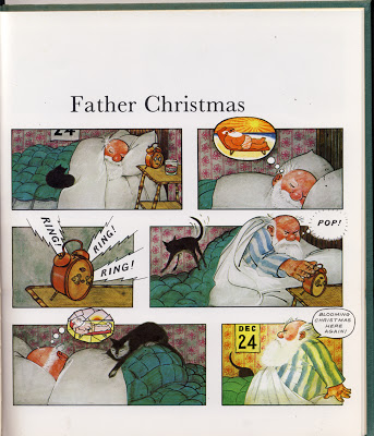
FATHER CHRISTMAS, by Raymond Briggs: This was one of my first picture books. My parents gave it to me when I was three. When I was little I loved looking at all the gorgeous details. As I got older I appreciated the dark humor. I can be very grumpy, but I hope I’m a somewhat likable grump, like Father Christmas.
briggs4
                                                                                                                                                                                         
THE THREE ROBBERS: I don’t know if there’s an illustrator stronger than Tomi Ungerer. I don’t know what else to say. That he could bring his sensibilities to bear in children’s books is a miracle.
                                                                                                                                                                                         
CHOCOLATE: THE CONSUMING PASSION, by Sandra Boynton. I got this book for Christmas or something in 1982 because I loved chocolate. It’s hilarious, charming, and quite informative. And I’ll never forget the acknowledgement: “There are many without whom this book would have been impossible. There are many others without whom it would have been a heck of a lot easier.”